Based in Indiana, Weaver Popcorn Company, Inc. was founded in 1928 and is the largest popcorn company in the U.S. Their popcorn is sold in more than 50 countries around the world.
Web Design, User Experience, Front-End Development, User Interface Design, Project Management, Web Animation, 3D Animation, Product Photoshoot, Copywriting.
Every element featured on Pop Weaver’s homepage could have its own case study. That’s how much attention we paid to each detail. We spared no resources, creative ideas, or efforts for this project, putting in over 352 hours for the design alone!
In order to design a stellar website, we started by building a solid understanding of Pop Weaver’s business and market positioning. Over several weeks we visited multiple plants and offices.
We studied Pop Weaver’s competition, customers, partners, manufacturing process, business goals, corporate culture, website pain points and future development ideas. Research was done entirely in-house through stakeholder interviews, surveys and data validation.
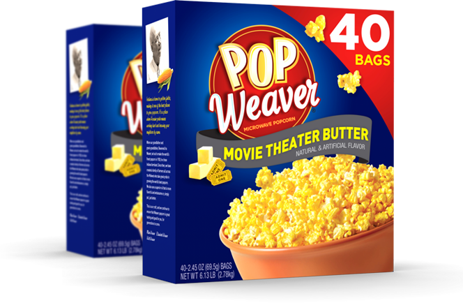
We wanted to include exceptional elements to make Pop Weaver’s website stand out. From a 3D popcorn box and flying kernels to an animated popcorn-making machine, we created a truly memorable experience.
All 3D models have been created and assembled element by element, so we can animate each image, enhance it, render it, and make it come to life. These provide a truly custom and memorable approach, unmatched by any competitor in the space.
Pop Weaver’s website does not have a single stock image, with each visual asset created in our studio.
How did it all happen? Well, we popped a lot of popcorn (our favorite flavor: Extra Butter) and had lots of fun shooting different photos and videos on different backgrounds.
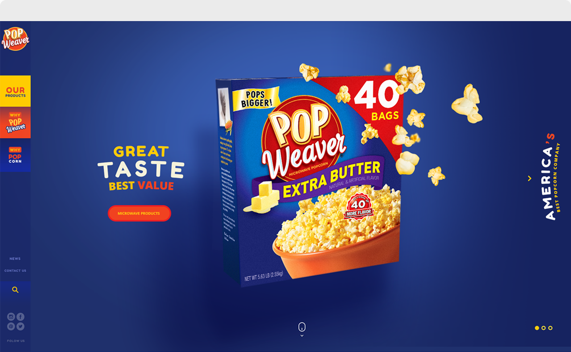
We carefully chose every word to present Pop Weaver’s wholesome products and high quality standards—with plays on words, short teasers, and a distinctive tone of voice.
We had fun talking about company’s philanthropic work, the festivals Pop Weaver supports, and autonomous growers.
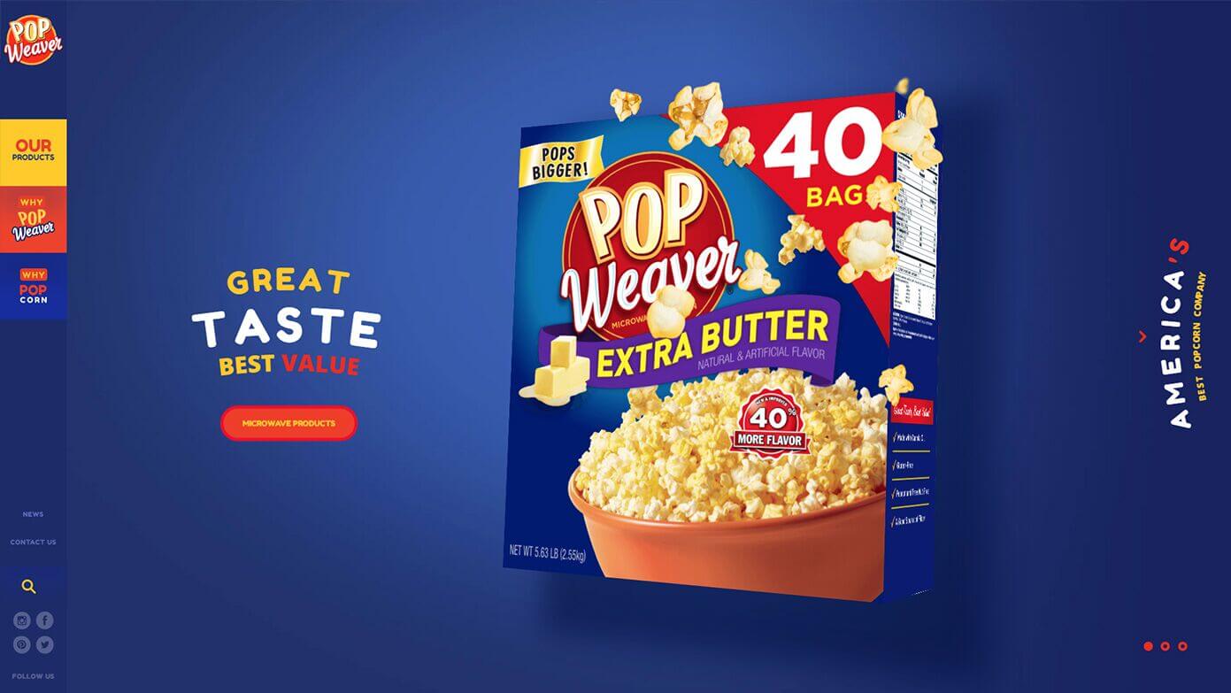
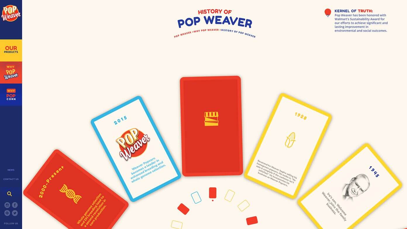
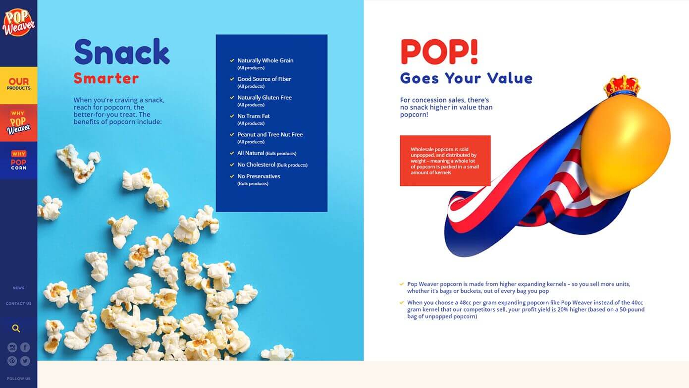
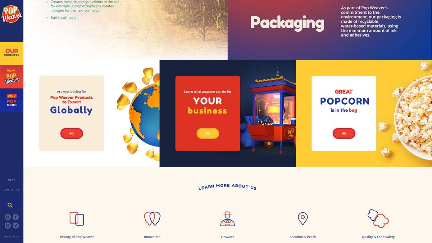
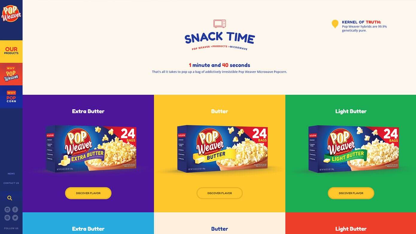
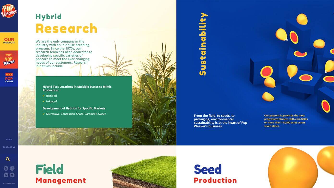
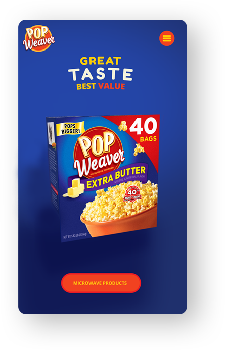
We chose to ignore the popular horizontal menu bar and made the bold decision to hide the menu vertically, on the viewer’s left. This freed a full screen to display a beautiful, cinematic vision of Pop Weaver.
The open space and large-scale images created a fantastic mood and presented the brand as the king that it is.
We faced a few challenges when coding the round shapes of site’s visuals, titles and navigation. It wasn’t easy to recreate the outline of Pop Weaver’s branding for certain details of the site, but in the end, the effort was well worth it.
The website carries lots of micro interactions, fun animations, and attention grabbing calls-to-action.
We even lit the entire site at an angle so that the light falls on specific design details to help them “pop.”
More
projects
We use the power of digital technology to engage your audience...