We executed a comprehensive website redesign, enhancing the UX with advanced personalization and a specialized recruitment microsite. Our strategy incorporated interactive elements, seamless legacy integration, and a focus on growth, significantly boosting Turner's digital footprint and aligning with their future goals.


Jeff Nordstedt, Director of UX
Web Design, UX/UI Design, Responsive Design, Front and Back-End Development, Motion Graphics, Web Animation, Project Management, Third-party Integrations, CakePHP Custom CMS, GDPR Compliance, WCAG AA Conformance, Web Accessibility, SEO.

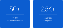
One of the largest builders globally, Turner Construction Company has a team of 10,000 employees and completes a staggering $15 billion worth of construction across 1,500 projects annually. The company consistently delivers awe-inspiring architectural marvels like the Burj Khalifa or the SoFi Stadium.
Turner's website redesign was a great challenge in terms of ambition and duration. Our team needed to address the specific requirements of separate regional offices, emphasizing their portfolios and expertise.
Simultaneously, the redesign aimed to cover a broad spectrum of corporate topics, including Turner's values, services, projects, and career opportunities. Considering the extensive scope of this global brand, a unique strategy was necessary to successfully complete this project.
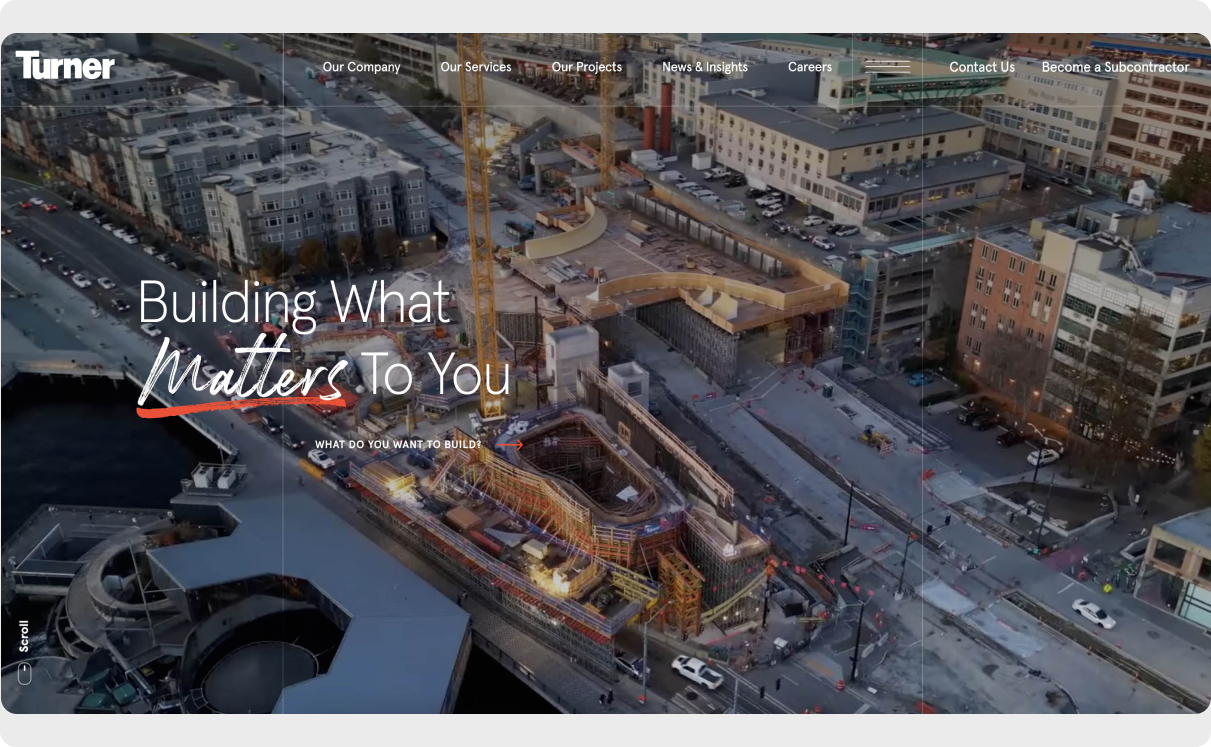
Image selection played a central role in shaping the design narrative. Our goal was to craft a website radiating boldness and innovation. The new design captures the awe of Turner's work and leaves a lasting impression on visitors.



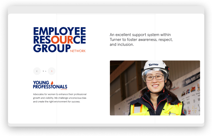
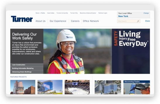
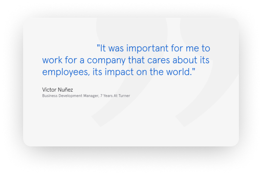
Through extensive research and employee interviews, we gained deep insights into the exceptional individuals and deeply ingrained corporate values at Turner. This exploration inspired us to create the tagline "Building what matters to you," perfectly capturing Turner's essence.
The previous website merely showcased projects across various locations, missing the emptional connection their brand can make with audiences of all types. Recognizing and addressing this gap became a pivotal moment in our transformational journey.
As with all our projects, we immersed ourselves in Turner's world and delved into identifying specific website pain points and challenges. We interviewed over 30 leaders across Turner's business.
Turner's website caters to three distinct audience segments: individuals seeking to hire Turner, potential employees considering a career at Turner, and the larger community, including government officials and environmental advocates.
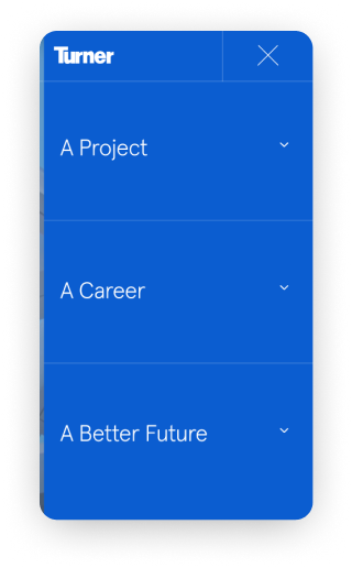
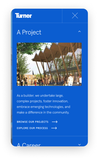
eDesign's team analyzed the project imperatives and mapped personas to understand Turner's corporate positioning. Then, we searched for the overarching emotional need shared by all our audiences. In Turner's case, this unifying feeling is the desire to make a meaningful project, career, or future.
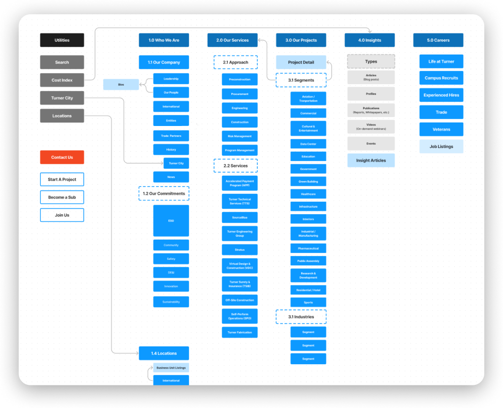
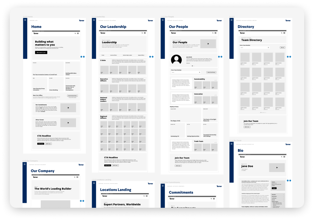
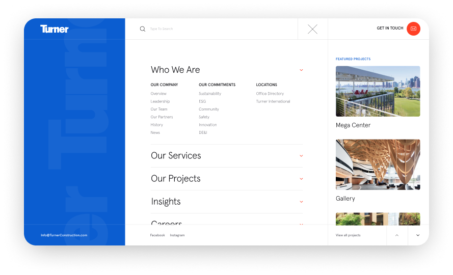
Recognizing the different objectives of each audience segment was crucial in addressing their specific needs. However, designing an intuitive navigation system that caters to all of Turner's audiences simultaneously was challenging.
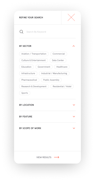
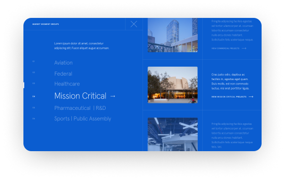
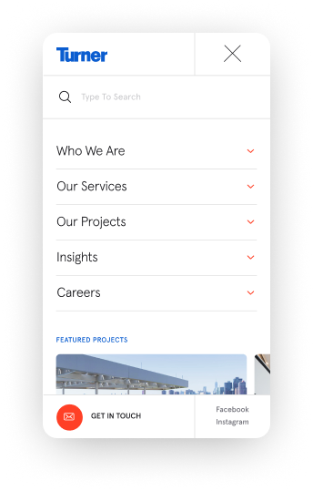
To strike a balance, we implemented smart user preferences and organized the menu around quick access to relevant content. The hero section and calls to action include personalized options, helping users navigate the website. This tailored approach ensures that each audience segment can easily access the content and features most relevant to their unique requirements, resulting in a user-friendly experience for all visitors.
Turner operates many decentralized marketing teams spread across multiple regional offices. Our task was to design a website that allows for flexibility in showcasing local content while ensuring consistency across borders. Achieving a balance between customization and design standards required innovative thinking. Our aim was to empower local teams while upholding Turner's brand image and message. eDesign introduced a "News and Insights" section, providing marketers with the ability to generate compelling content beyond conventional press releases. This new feature empowers Turner to easily share case studies, project photos, and success stories, thereby broadening their scope for content creation. Marketers were thrilled upon discovering the web space we designed specifically for them, offering a seamless avenue to craft and publish engaging stories.
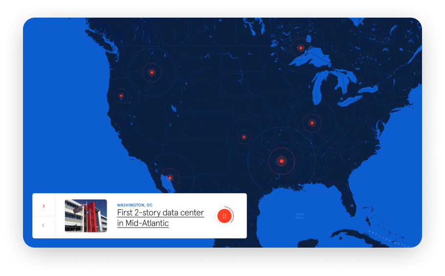
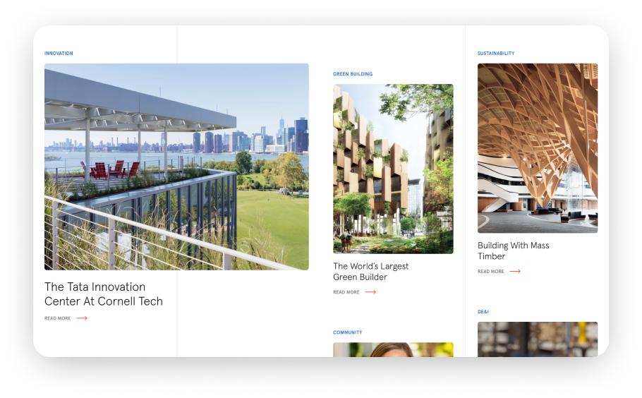
The objective of the website redesign was to elevate the old site, integrate many legacy materials, and plan for future development. Designing a more modern web presence and prioritizing users’ needs required careful negotiation. Navigating a complex stakeholder network meant influencing senior leadership through intermediaries. Dealing with the complexities of a large corporate structure, especially without direct access to decision-makers, resulted in a complicated and prolonged process. Overcoming these challenges required extensive brainstorming, strategic planning, iterative design, and meticulous execution.
The back-end programming posed another hurdle, as legacy content needed to be migrated to the new architecture. With thousands of pieces of content and tags involved, manual migration was impractical, so we devised clever methods to map and move the information while improving its organization and usability.

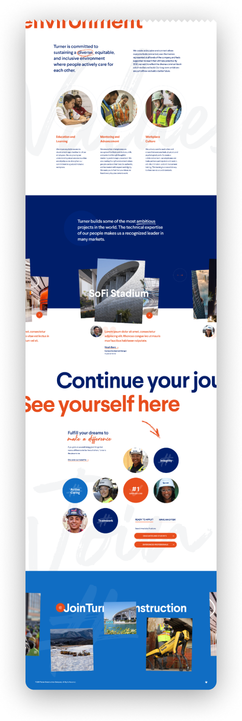
We took pride in launching join.Turnerconstruction.com, a dedicated website for student recruitment, highlighting Turner's commitment to fostering talent and attracting passionate individuals.
The microsite illustrates Turner's unique career opportunities. It serves as a complementary platform to the main website and places a strong emphasis on diversity and inclusion. The site positions Turner as an employer of choice for engineering students, showcasing the company's commitment to innovation and personalized career growth.
The microsite launched ahead of the main website release and played a significant role in developing a corporate design system and efficient content management.
We built the website using a custom Content Management System (CMS) based on the CakePHP framework, specifically tailored to meet Turner's requirements.
The CMS we developed is highly robust. Its interface is intuitive and easy to use. Any employee with no technical skills can edit content, create new web pages, and add beautifully pre-designed blocks of information.
eDesign’s customs CMS gives Turner the flexibility to administer every page individually. The CMS was built to scale as content grows, traffic increases, and marketing technology platforms are added. Our back-end development team fine-tuned the code to deliver fast loading times, efficient database queries, and overall enhanced performance, resulting in a better user experience. We also made sure the CMS is completely secure and protected against vulnerabilities.
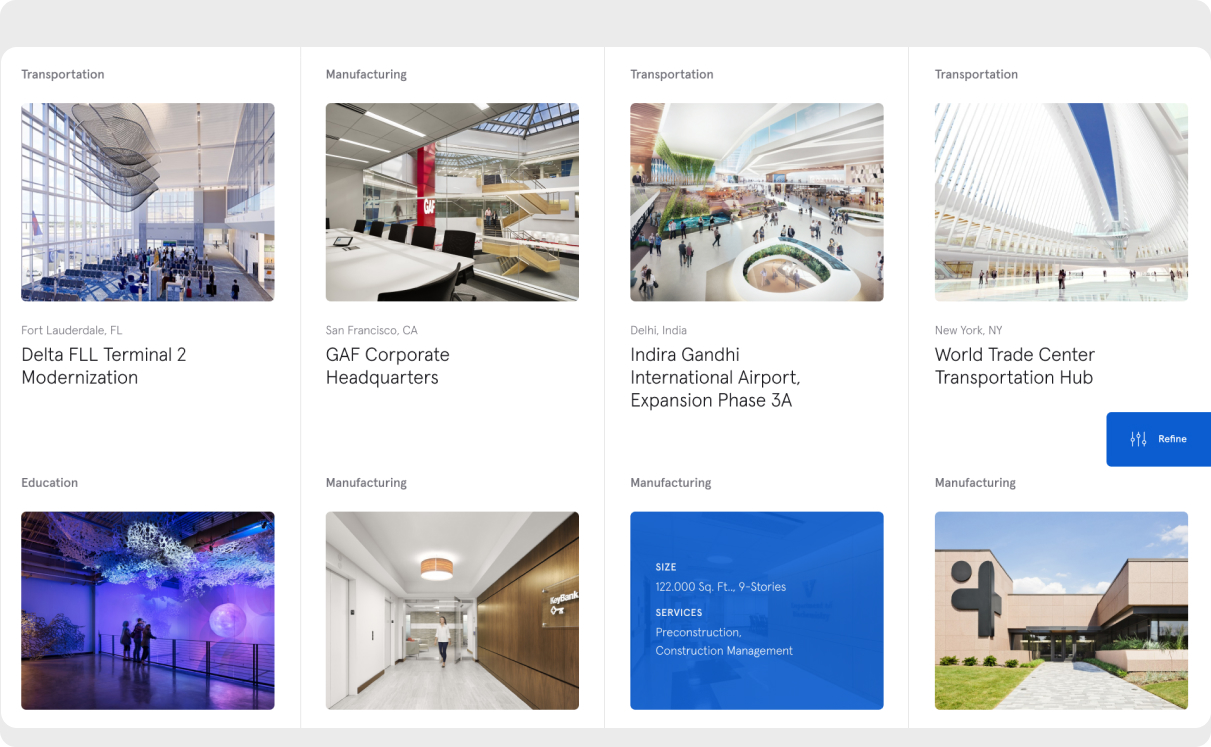
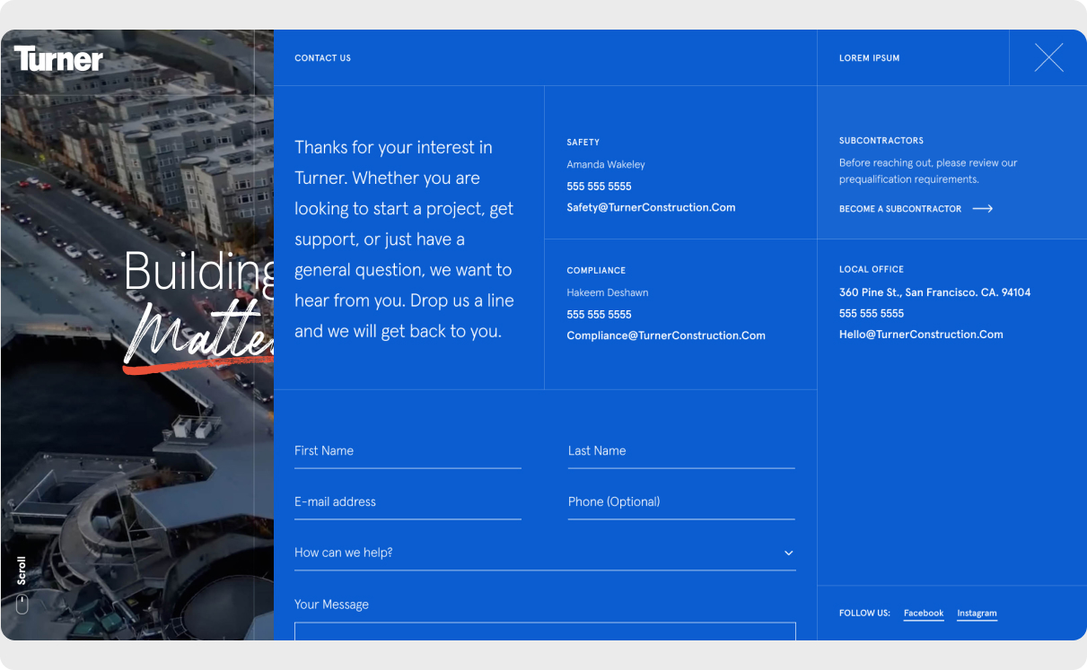
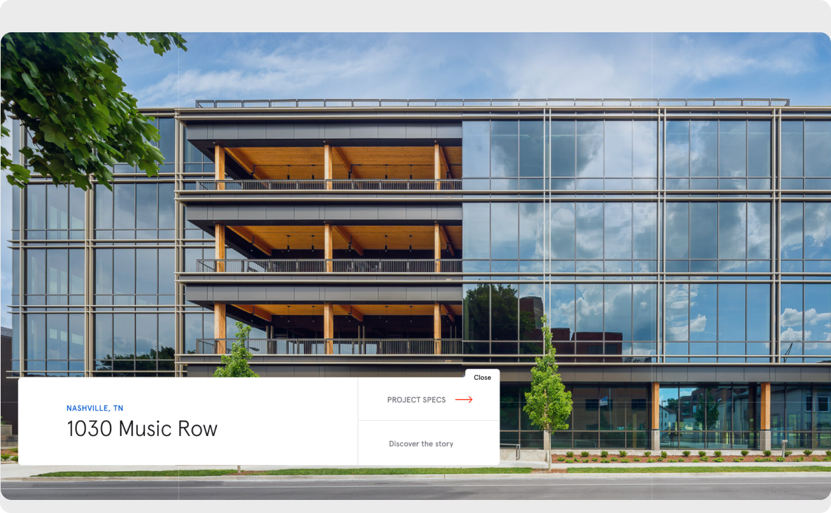
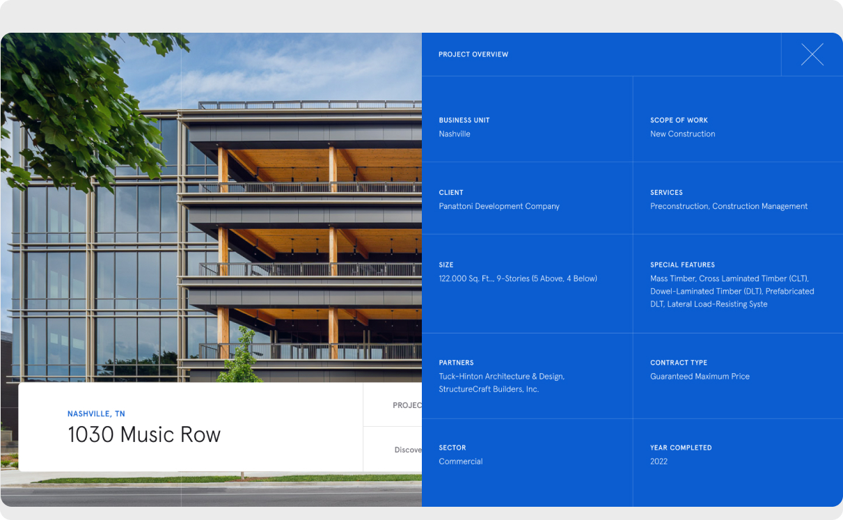
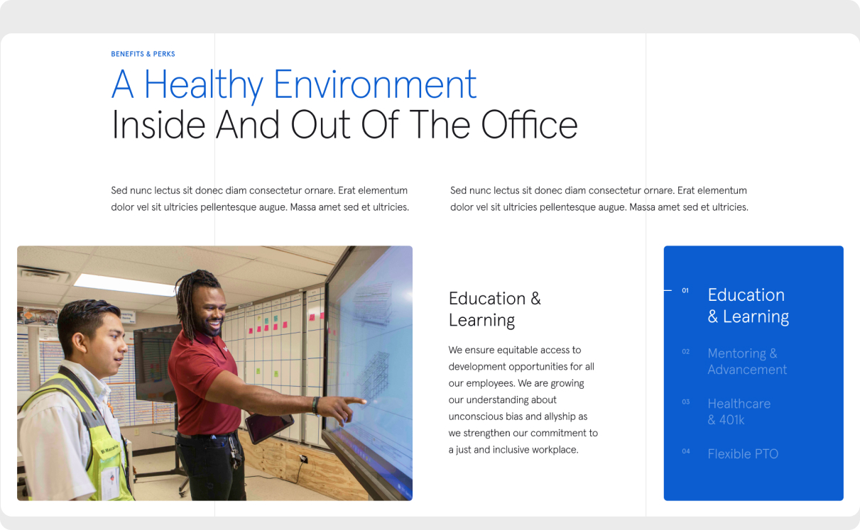
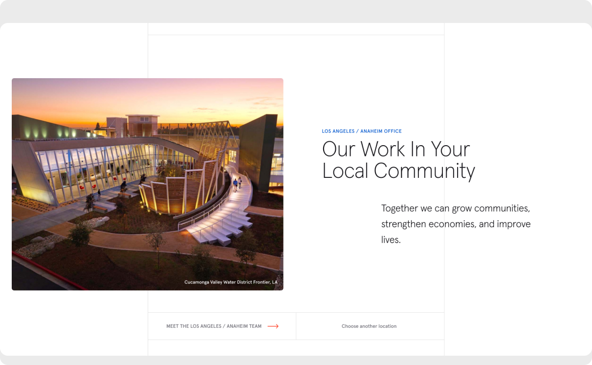
Our collaboration with Turner Construction Company resulted in the creation of a compelling online presence. We translated Turner's unique requirements into a modern experience with a user-friendly design that communicates the company's core values and expertise to a wide range of audiences, instilling a sense of purpose and passion.
The enhanced corporate website features video backgrounds for an immersive user experience.
It includes modular building capabilities and empowers the regional marketing teams to manage localized content effectively.
Turner's outdated site underwent a remarkable transformation. Website sessions soared to 261,005, a 44.8% spike since launch, spanning all countries and channels. We take pride in moving the company ahead of their previous web presence. While we have achieved significant success, there is further potential for modernization to fully reflect this dynamic and amazing company.
More
projects
We use the power of digital technology to engage your audience...