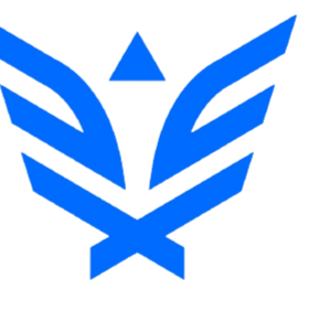
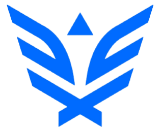
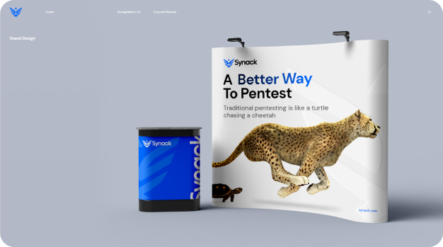
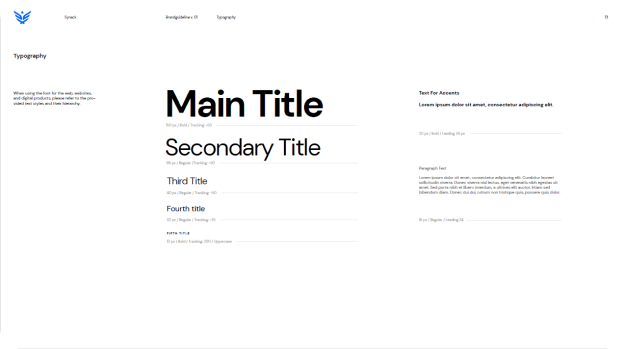
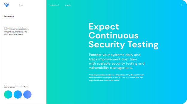
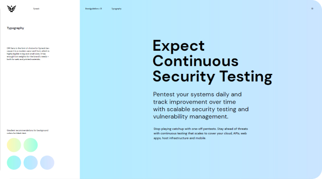
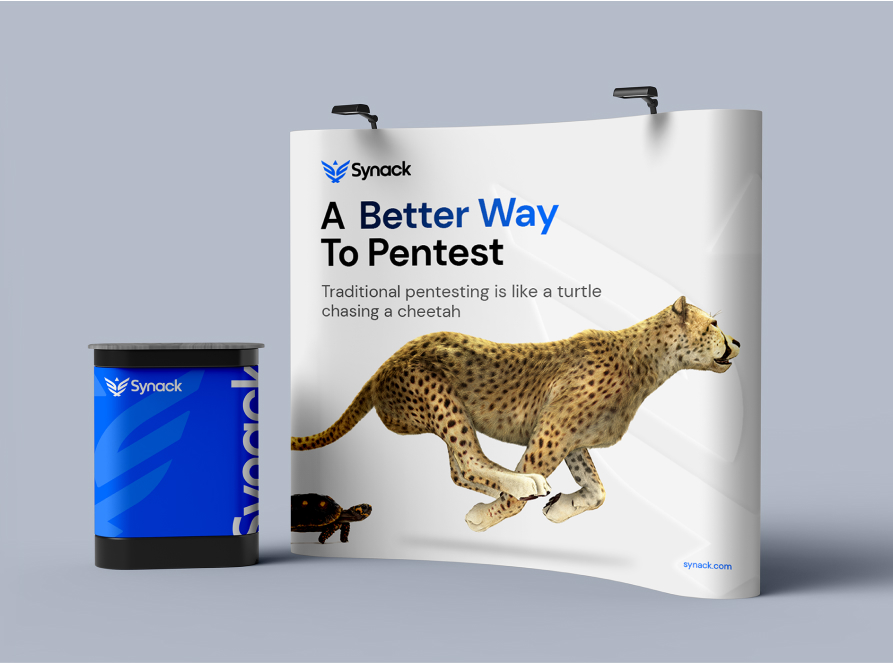
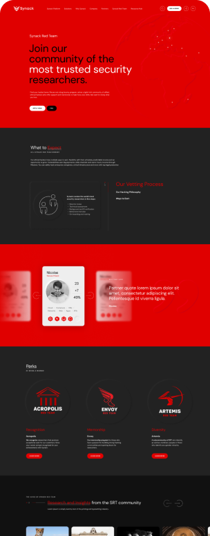
Synack had requested for subtle brand enhancements, emphasizing that they did not want a complete rebranding. The process of developing the new website presented a great opportunity to revitalize the brand. This involved aligning the logo symbol symmetrically, updating the typography, and intensifying the brand's colors for vibrancy and memorability.
Fusion of Artistry and Cybersecurity
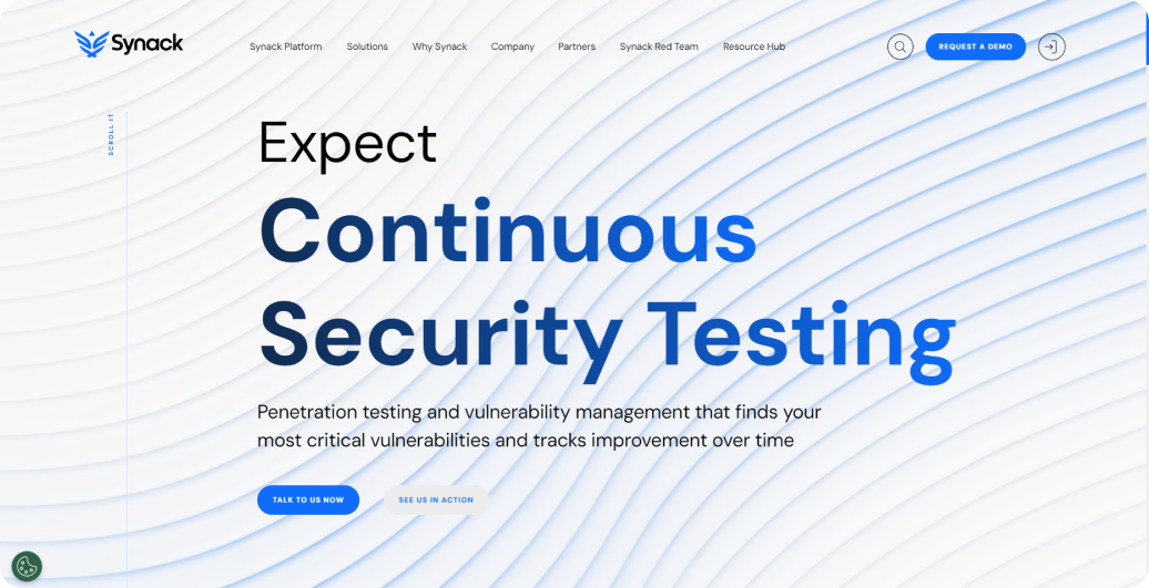
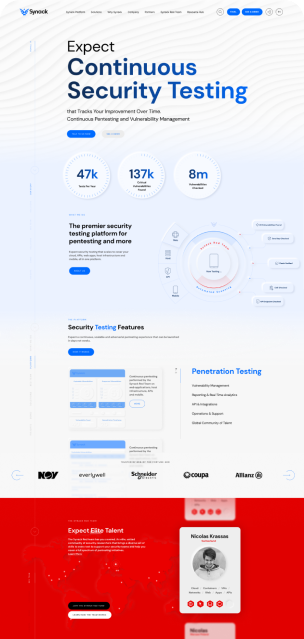
The concept of waves in the website design is a metaphor for continuous security testing. It symbolizes Synack's commitment to protecting each site in the vast sea of potential hackers.
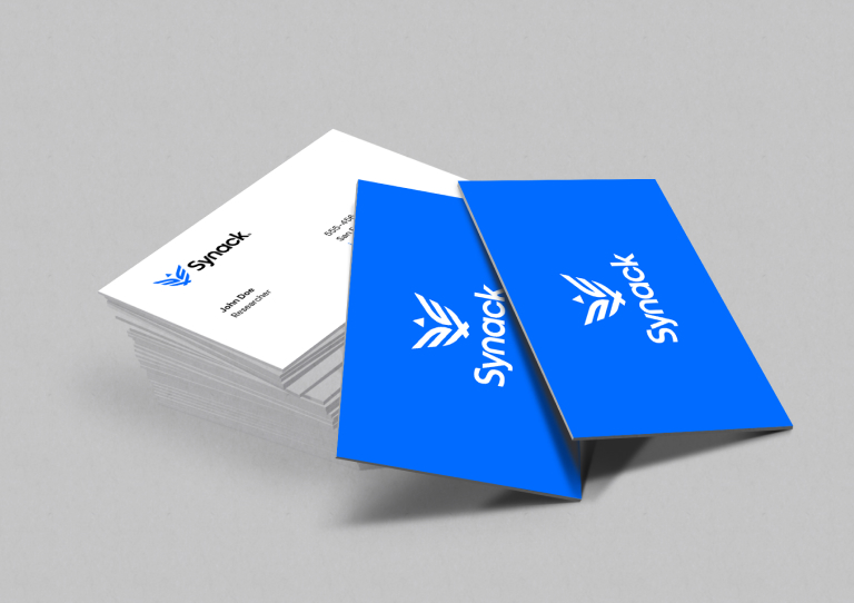
During the brainstorming phase, the idea and visualization of the waves underwent numerous iterations. We explored various lengths, angles, shades, shadows, and movements before arriving at the final design. These wave textures are now integrated into multiple aspects of the company's branding, letterhead, business cards, and more.
More
projects
We use the power of digital technology to engage your audience...