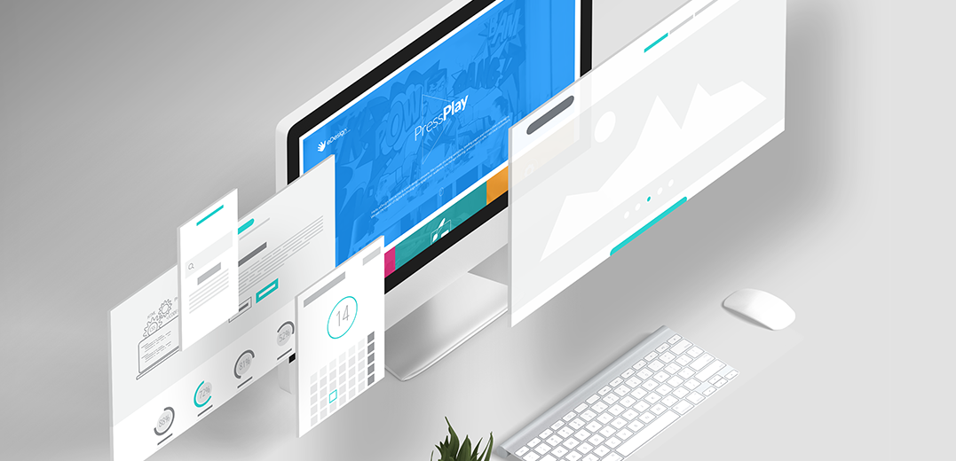
Contrary to expectations, web design is less about the visual esthetics of a site and more about functionality and business goals. Creating a beautiful website is not enough if you lack a solid user strategy.
This is where wireframing comes in handy.
Building the wireframe of a website happens after a multitude of brainstorming sessions and detailed brand research (the “discovery phase” of a project). It helps our analysts assemble a visual scaffolding of the important interactions, user paths, and calls to actions.
This process often surprises clients. Looking at the wireframe of their website, they sometimes feel disappointed. So it’s extremely important to stress: a wireframe is NOT the design of a website. There’s a big difference. A wireframe simply documents the user experience. The final website design will most certainly have no visual similarity with the wireframe (none!).
Why Is Wireframing Important?
Wireframing is used for UX, UI, and business strategy reasons. Building a wireframe allows us to clarify the main features of a website. It also allows analyzing the usability of a page by showcasing its layout: navigation, calls to actions, range of functions, rules of displaying information, conversion paths, etc. Wireframing validates the important information a designer needs to take into consideration while crafting the web visuals.
By “testing” a website in a wireframe state, we probe possible flaws in the business reasoning or architectural composition. It’s a great way to avoid content gaps later on in the process.
Wireframing is an investment up front, but it saves time later on. Think of your wireframe as a compass. It shows you the best route to the final destination.

Who Gets Involved?
Working on a wireframe is a collaborative process. Our developers use wireframes to review a site’s functionality. Our design team uses wireframing to create the user interface. Our UX designers use wireframing to support navigation paths between pages. And our business analysts use the wireframe to probe the business objectives of a site. Last but not least, our project stakeholders review a wireframe to ensure all requirements are met.

Wireframes Aren’t Pretty
A wireframe is typically stripped of any colors, graphics, or typographic style. The main purpose here is to build a business smart blueprint. The focus is entirely on the functionality and not what elements look like. It’s simply a tool for us to group the content, pages, and information together, and make sure no web page is left behind.
It may seem redundant. Why build a wireframe if we can use our client’s existing website page content? The answer: wireframing is extremely useful for our UX designers. It helps provision for the right user pathways and layering of animations once we create the final visuals.

Software
The software we use for wireframing is called UXPin. It’s the ultimate collaborative design platform, allowing entire teams to participate in the design process. It helps us scale each project’s UX processes.
Once a wireframe has been approved by our client, we switch to InVision, our favorite platform for product design. InVision helps us showcase a design in an interactive way.
If you need help redesigning your website into a fabulous new look, just say hello@edesignInteractive.com. Our team can help you engage your audience, encourage sharing, and boost sales.
Websites, campaigns, or rocket ships; let’s create something awesome_together!
You can find examples of our work here.
