We’ve decided to write this post, not just to show some “behind the scenes” insides of our work, but also to bring up the qualities you should look for when hiring a digital agency.
Our team has been crafting beautiful visuals to digital life for over 14 years. You can trust our professional expertise when it comes to using the power of digital technology to engage an audience.
So what is the secret ingredient to a successful website design? Well, “success” is measured differently depending on the client we are working for, the goals we have set, and the type of customers we are trying to engage. You can read more about our research and discovery process to understand the analysis we go through before starting a new project.
Different business goals require a different design set, market competence, digital look, and feel. Depending on these, web designs fall into several categories, like “emotional branding”, “redesign”, “data conversion”, etc. Let’s look at each one of them to appreciate the contrast.
Emotional Branding
Our team is big on the power of emotions. Most purchasing decisions are aided by emotional connections, rather than a rational priority. It’s all about capturing the hearts and minds of your audience.
“Photographing Love”
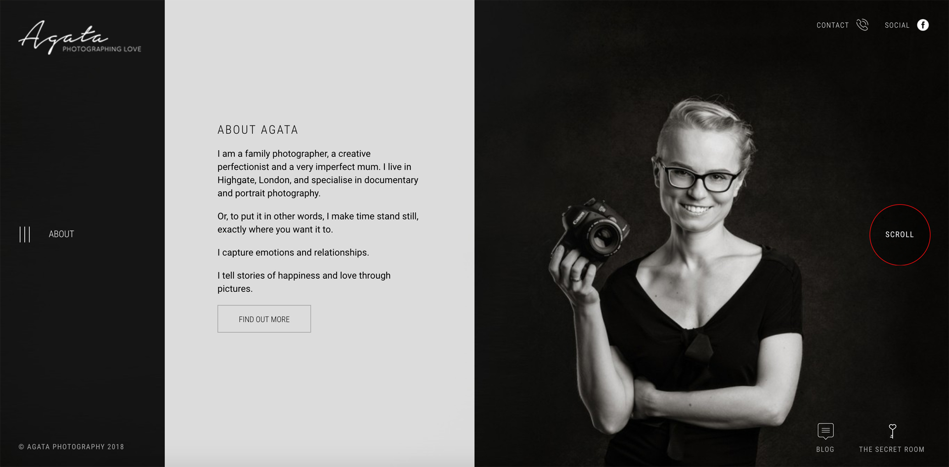
We’ve built this website as a journey into Agata’s world. The story takes viewers into Ags’ studio for a “behind the scenes” photography session. Every page here is designed to tell a story or drive a call to action. The viewers have the opportunity to connect with Agata, experience her art, and follow the photographer on a typical day of her work. We’ve made our client the driving force behind her brand in order to create this emotional connection her audience needs to feel.
This website design became extremely popular overnight, winning major awards and nominations in Europe and the US.
The takeaway from this project: your audience craves authenticity and human emotions. When you design a website of your own, keep users’ experience in mind before anything else.
Storytelling
A brand is a matter of perception. To create a website that draws traffic in, you need to build a personal connection between your product and its audience. With every project we undertake, we aim at telling company stories that are authentic, creative, and inspirational.
The “Hero Attitude”
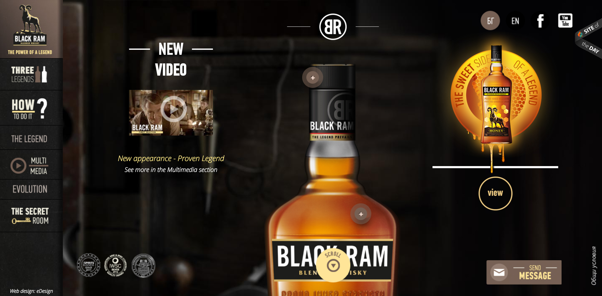
Black Ram is a famous aged whiskey blended with golden barley and pristine mountain water. This web design project is a unique story of reinventing a brand, repackaging a product, reviving a legend. How did we do it? We aimed at designing a stunning vision true to a whiskey star. Our team used gorgeous visual frames and saturated colors to make the blend come alive.
But this web design is not just about beautifully executed images. It’s the combination of art with elements of storytelling that establishes Black Ram’s fascinating world. The goal here was to create a perception of a centuries-old whiskey tradition with a bite of mysticism. To achieve our vision, we’ve portrayed the product as the hero: bold, daring, and spirited. We’ve also scheduled a social media enigma with Black Ram’s “Chamber of Secrets”, which opens only for special Facebook/Instagram/Twitter campaigns.
The takeaway from this project: think of your storyline as the main compass for your branding.
Build-Up Anticipation for Your e-Commerce Store
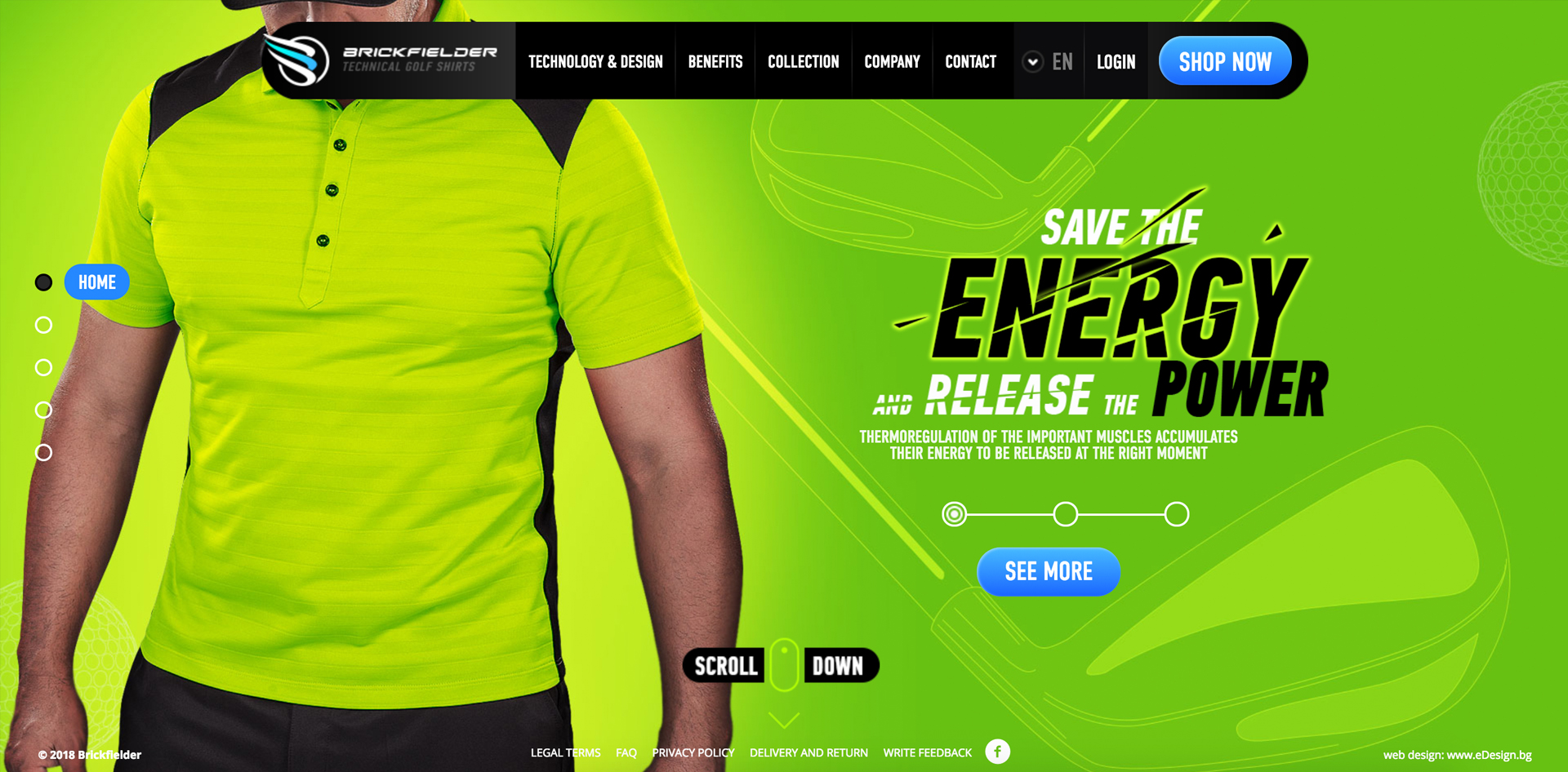
Brickfielder came to us to create their website and online store. With no visuals of the product, no previous marketing materials, or digital graphics, the project began from the ground up. We paid attention to every detail to create a high energy, high fashion sports mood. We’ve added a seamless integration of a shopping cart, user registration, merchant processing, easy to browse clothing collections, size and texture options, promotions and coupons, social media and pinnable galleries. Building a customized store from scratch is easy when you can rely on our fantastic back-end development team. What makes the experience unique though, is the way we decided to present the product, staged in different acts of a visual story. Users learn about the fantastic quality of Brickfielder’s shirts by seeing the performance as it plays through with 3D biometrics and images before they realize they can buy the product right here too. By building the website as a story, we also build up the anticipation of users to acquire the merchandise.
The takeaway from this project: your e-store needs to differentiate itself from the thousands of other e-commerce pages. Try storytelling and building up the anticipation. Also, make sure your shopping cart is available in only a couple of clicks. No one likes to go through countless steps when making a purchase.
Create a Real-Life Adventure on Social Media
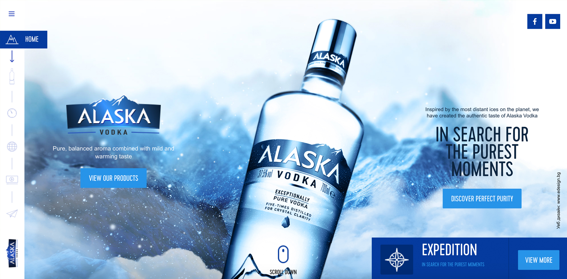
is a website design inspired by Alaska’s highest mountain range and the purest ice caps on the planet. The website design is a wonderland of floating snowflakes and mountain mist that take you right to the heart of the brand. Scrolling along, viewers can take different roads to discover the craftsmanship and the quality of the ingredients behind the authentic taste of the product. Besides the breathtaking visuals, our team wanted to take viewers further along, in the footsteps of a real mountain expedition.
A fantastic social media campaign was designed and broadcasted live to the world, challenging Bulgarian alpinist Doychin Boyanov to “conquer Alaska” and bring back ice from the tallest peak in North America- Mount McKinley (“Denali”). Viewers follow the crew’s story as they trekked, towed equipment with a sleigh, and climbed from one basecamp to the next on the way to Denali. By embedding an element of a human challenge in Alaska Vodka’s story, we aimed at displaying a visual experience that truly resonates with customers.
The takeaway from this project: storytelling, blended with social media can take on a whole new twist.
Awaken the Senses
Great website design creates an engaging user experience.
Timeless Looks
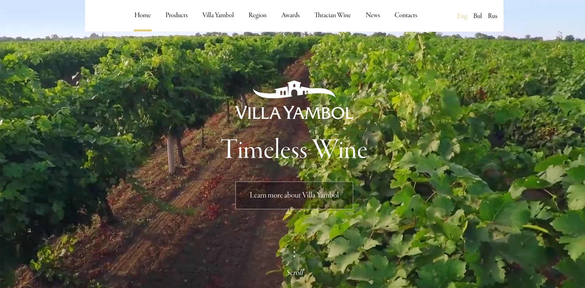
Vinprom Yambol is one of the leading exporters of quality red and white wines in over 20 countries worldwide. In this website, we aimed at creating a contemporary design that embodies the spirit of the winery. To do this, we’ve used gorgeous custom photography manipulated to perfection.
To awaken the viewer’s senses we chose to show the brand’s passion for the land, devotion to their craft and love for wine in every image. We’ve designed the website as an immersive experience. No need to be a wine lover to appreciate a stroll along the lush vineyards, a glimpse of the winemaking process, and sweet grapes soaking in the sunlight. By using sound, storytelling, and emotional components, we engage the human senses and create a spontaneous connection between the user and the brand.
The takeaway from this project: custom-made photography is the best way to showcase your brand’s passion and purpose.
Transporting Users Into Brand’s World
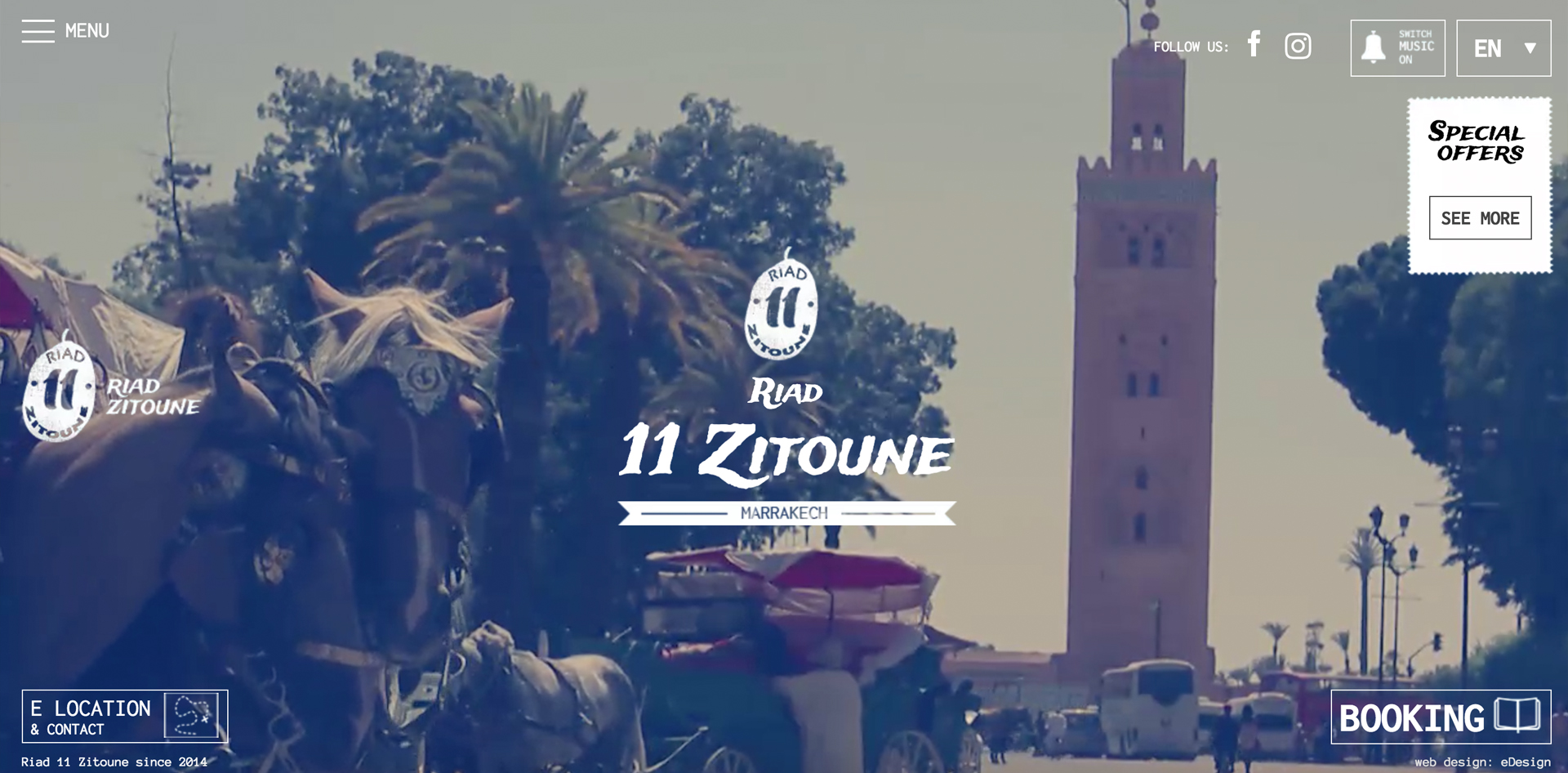
In this example, a traditional riad (hotel) in Marrakesh, was in need of a brand identity, a logo, and a website design. To differentiate Zitoune from the hundreds of boutique riads in Marrakesh, we needed to find the best emotional way to connect with travelers. We decided to portray how special this place is, by transporting people directly to it.
Beautifully crafted video scenes let viewers experience Zitoune’s adjacent streets, vibrant soul, the chaos of colors and flavors. You can almost taste the exotic aromas that hang in the air. We also added music to the mix for a full emersion experience. An interactive view of the rooms shows their unique charm, designed in the old days of Morocco. By using video and sound, we stimulate the imagination and lead travelers into the old Marrakesh of 1,001 Nights.
The takeaway from this example: Use authentic video images to bring the users into your world.
Convert Business Data into a User Experience
This is easier said than done. Here are some examples that convey the message.
Business Logic
Putting together a corporate look for certain industries can be more challenging than others. With the banking industry, the perfect design needs to be contemporary and beautiful, while at the same time assert the core values of the business, convey trust, efficiency, and quality of service. Here, our client is a thriving community bank with more than 350 employees and assets in excess of $1.2 billion.
In a business where clients trust you with hundreds of thousands of dollars, having a well designed user-friendly website is a necessity. Each page needs to feel open and modern. The home page puts the accent on online banking, small loans, and a location finder. BCB’s platform is a perfect fit for the current versions of each major browser to ensure a quality user experience. Clients can log in to their BCB accounts straight from any computer, tablet or smartphone. But the most important part of all is security and user privacy.
The takeaway from this example: security should be a strong concern when building the back-end of your website.
Corporate Chic
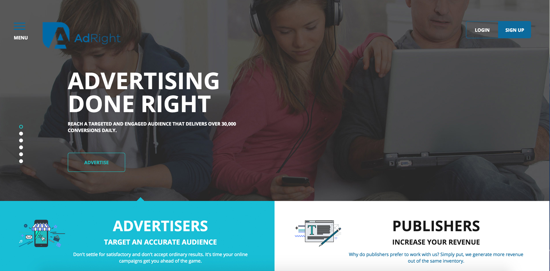
Here is another example of how to introduce a big corporation in a fun and playful way that yet creates a sense of trust and authority. Working for AdRight, we aimed at designing a website that shows the brand in all its glory. We’ve spared no graphics or animations.
Our client is a performance-based company, serving a network of 500 Million ad impressions daily (wow!). This is why they chose our team, to deliver measurable branding and web design results. Every business profile online needs careful consideration. The tone of voice of a corporation is extremely important. Your website needs to build trust while at the same time expressing a playful side of your business entity.
The takeaway from this project: animations, moving graphics, and pictograms can help direct the viewer’s focus towards your key data.
Gamify Your Message
There is also a way to market yourself online that is completely out of the box from traditional website information. We have created designs for companies who wanted to take a radical approach to entertainment and build their whole website as a game for users to interact with.
Transform Federal IT with Visualization
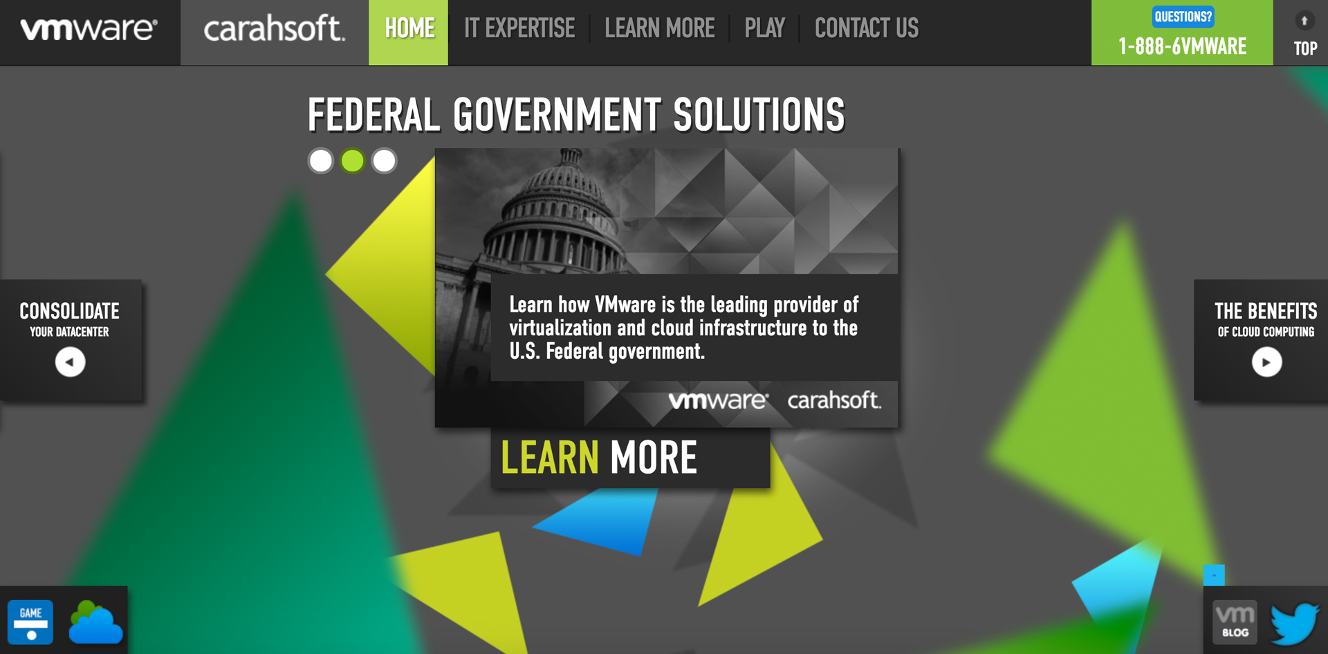
In this example, VMware’s government solutions website is designed as one big pinball game, where players learn the benefits of IT infrastructure for the U.S. Federal government, U.S. cabinet agencies, military services, legislative and judicial branches. Reading through heavy data becomes a child’s play. The website makes is easy and fun for users to learn about VMware’s Federal Datacenter Consolidation Solutions and the benefits of cloud computing.
Is this a typical design approach? No. Does the simplification of facts help to connect with VMware’s audience? Definitely yes. The whole idea is that complicated services are easy to understand, to apply, and to implement. Message received.
The takeaway from this project: think outside the box
Make Taboo Issues Lighter
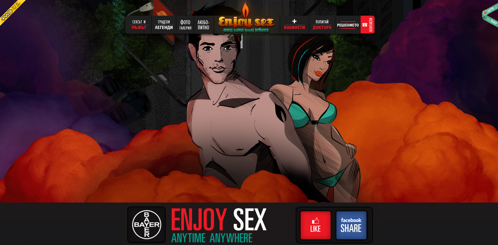
Bayer AG, the German multinational chemical and pharmaceutical company, came to us with a challenge. Market a pill that is not easily accessible. It’s also a product part of a taboo topic in men’s world. We needed to find a way to communicate information on a delicate subject and ultimately promote a sensitive product.
Our team believes that optimum engagement happens through play. So we decided to turn the website into a visual game. We left visual clues, vaguely hid reading materials, and even a series of quizzes and tests. We blended together storytelling and surprising design. The website was further linked to a social media campaign launched on Valentine’s day. 42,000 people joined us and shared information in less than 10 days. We successfully transformed what could’ve been a difficult, even awkward conversation about a serious men’s health issue into an engaging, educational campaign that solves problems.
The takeaway from this project: Sensitive information needs extra creativity in order to be presented in a lighthearted, interesting, and engaging way.
Modernizing /Updating Your Existing Site
Every few years we recommend clients to review their presence and their platform online. Is your information still relevant to your business goals? Has anything changed with your strategy or your audience size in the last few years? Is your website engaging? Secure? Responsive? Does your website design reflect your products/services and offer the features your clients need? It’s always to good move to step back, analyze possible outdated data and restructure, redesign, or simply adjust your information online.
Know Your Audience
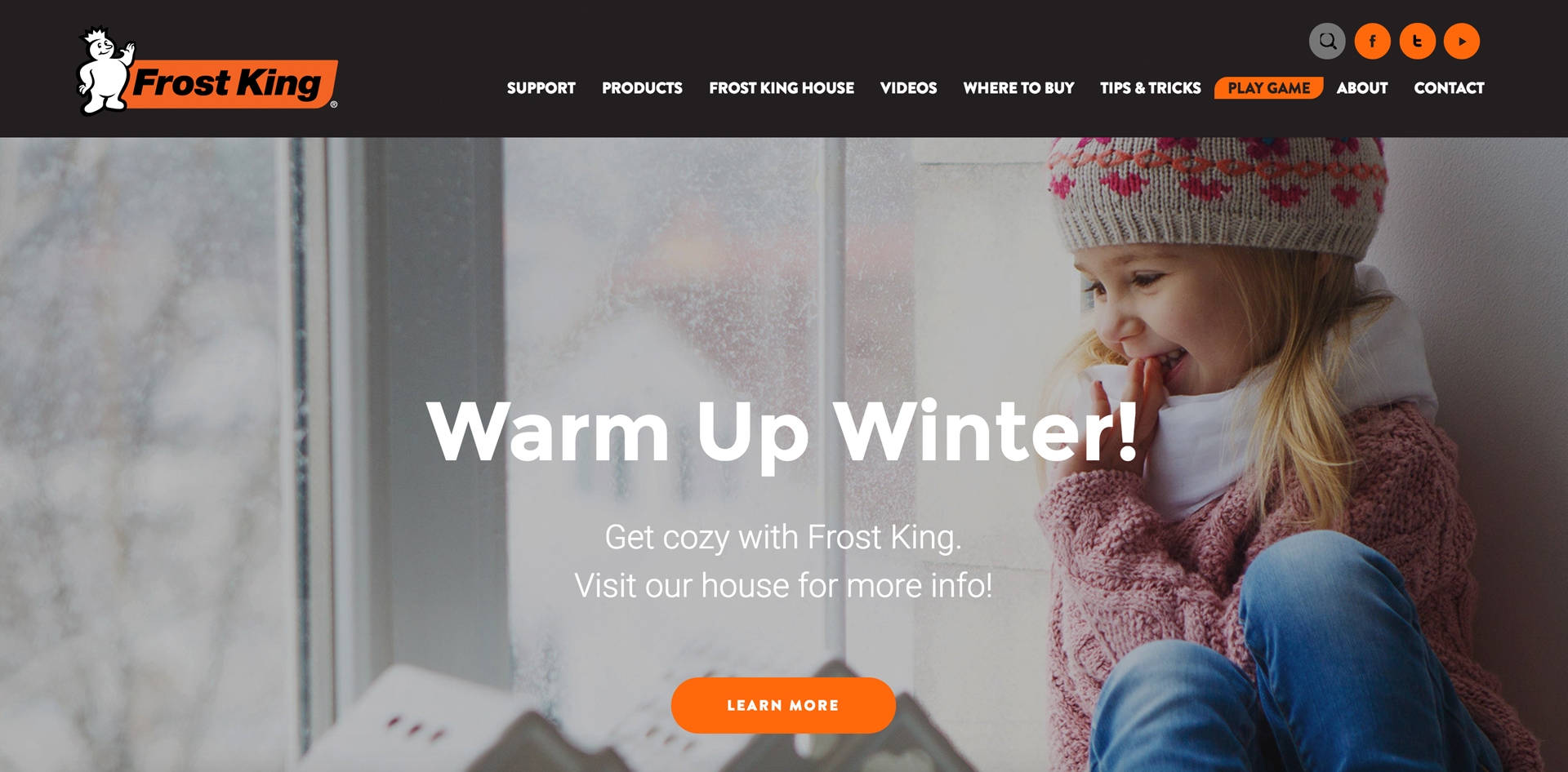
Our team had the honor to work with Frost King on redesigning their existing website. Our task: rethink the user experience and user pathways. We wanted to build a site that is intuitive and helpful to Frost King’s audience. Here, our focus was not on advertising merchandise. You see, Frost King’s audience doesn’t typically come online to learn about the brand… Their users visit the site for help, advice, ideas, and home insulation tips and tricks. So we’ve planned the site as an ad-on to Frost King’s merchandise. It is meant to be useful and add value for customers. We trumped the marketing logic for quality support.
Spend time to plan your UI and UX carefully. Your website needs to the built for efficiency and usefulness. Within seconds from landing on the home page, visitors should be redirected to the exact information they are looking for.
The takeaway from this project: If you are looking to update an existing site, be sure to pay special attention to the real estate on your homepage. Aim to create bright, open spaces that drive users’ focus on products or content.
We hope this article was useful and has inspired some ideas. If you need help with your website design or ideas for your social campaigns, don’t hesitate to reach out. Simply say hello@edesigninteractive.com, we welcome a chat.