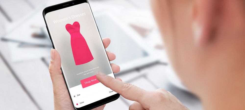
Product diversity is often used as a way to grow. However, listing more products on your website may not work to your advantage. While some customers would appreciate the abundance of choice, many more are likely to be frustrated by slower browsing and a vast selection process.
Current trends are moving away from multiproduct offerings as data shows that 64% of online consumers would pay a higher price for a more simple, unique, and more convenient shopping experience.
It’s time to examine your product options and your overall user interface design. Making choices obvious will help you create a better customer experience.
LESS IS MORE
Most companies feel like the more choices they offer online, the greater the customer base they can reach. In reality, offering too many products can be tiring and confusing (the so-called “paradox of choice”). Faced with too many decisions, customers shut down, refuse to complete their purchase, or choose a less desirable option.
Think about the choices you offer online. Could they be streamed down to the essentials?
Understanding human behavior and predispositions can help you design a fantastic website that converts clicks into business. In a nutshell: business development happens faster when you make things simpler for your customers.

EASY ACCESS
Every stage of strategic expansion requires hard thinking from the outside in. It also requires adapting your online space for new products and services. It’s imperative to evaluate your online real estate capacity and user interface design.
Studying the human brain, scientists have found that most of us favor shortcuts or the “path of least resistance”. This process shapes our interactions with the world around us, but also our behavior online. In other words, by making a purchasing decision the default decision, your interface can activate desired actions and win more business.
Investing in great website UX is important in order to design an online environment with relatively tight control. You can prompt customers to “choose” by guiding them straight to the desired option.
CREATE AN EXPERIENCE
You need to understand your customers’ online journey. Print every page of the selection path. Storyboard the steps to your shopping cart checkout. Where are the critical decision points? Can you eliminate some steps and ease the process? Assume that people are so overwhelmed by other priorities that even the smallest obstacle might discourage their purchase.
There’s no other way to say this. Keep your offerings simple and easy to navigate. If people don’t understand your brand’s message, struggle to browse your products, or wrestle to check out, they will quickly drop their purchase and leave your site.
To become a successful eCommerce store, you need to focus on creating a flawless shopping to a checkout experience that fits your brand’s promise and resonates with the values of your users.

For website advice, drop us an email at hello@edesigninteractive.com. We love making new friends.
You can find examples of our work here.