When you land on a website looking for specific information, what do you do? You probably browse quickly through the display of the homepage. If the answer does not jump at you, you scroll down to the footer and then possibly back up. If the information is still not there, you are likely to leave the site and never come back again. This is how important a footer of a website is! It’s your safety net catching visitors and helping them to find their way around and typically is seen in the first 5 seconds of someone visiting your page.
It’s fair to say that a strong website design calls for a visually effective and UX friendly footer design. Your SEO will benefit from this as well.
Here are some tips on what information to include in your website footer, how to improve its usability, and display your content.
Visual Design
Your footer is a very exciting part of your website. This is where information comes together and important links must stand out. It’s a great space for clarity, cleverness, and usability. Why not use it to your advantage?
It’s important that your website footer feels spacious, bright, and elegant. The information needs to be concise, clear, and easy to locate.

Here is a good example of clean and simple footer design. The focus is entirely on the main areas of the website. It’s easy to find out about Office Suites’ services, contact the company, or follow them on social media.
Keep the design simple to avoid information overflow or heavy graphics. The style, typography, and colors need to follow your branding guidelines and perfectly match the rest of your website design. You can play around with design elements that complement your branding or event small animations.

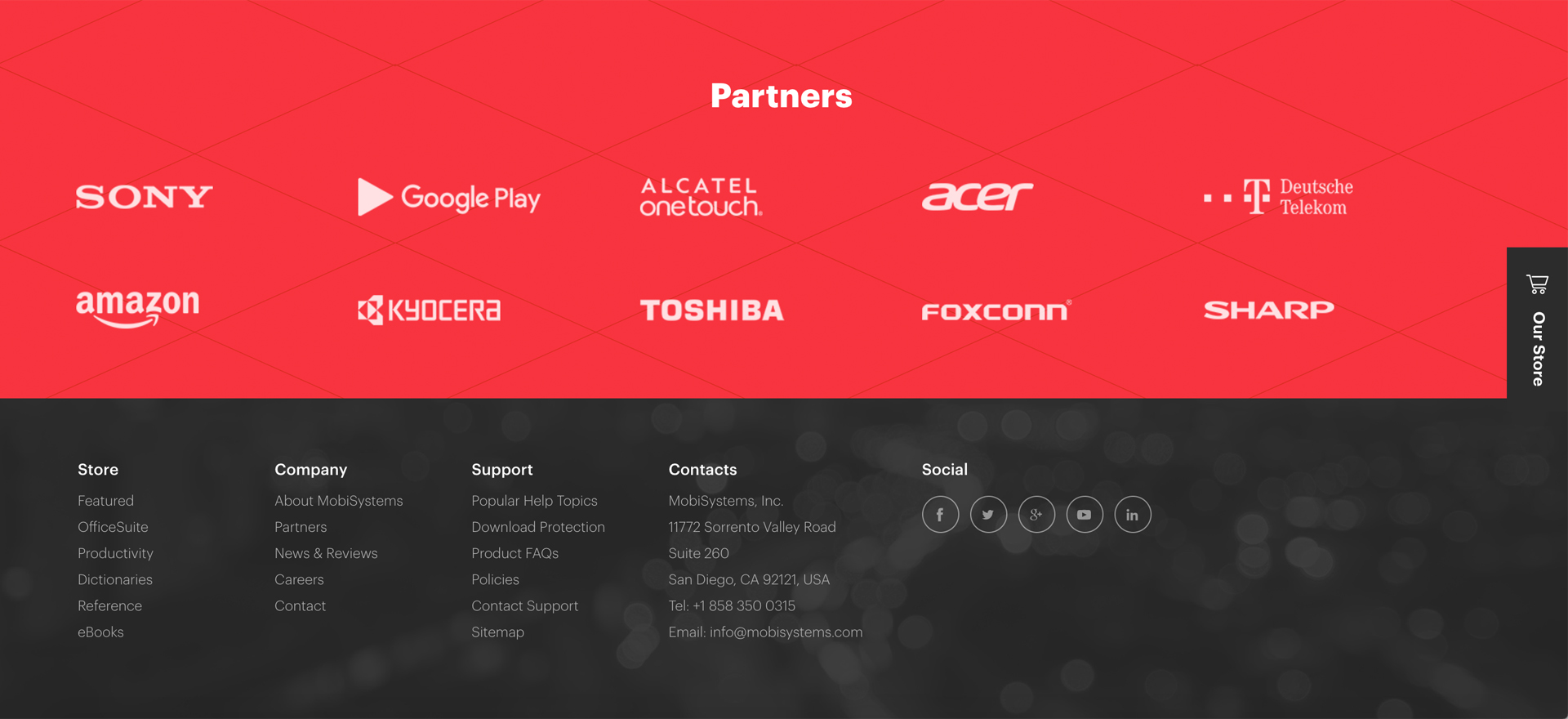
Here is a good example of a website footer that flows with MobiSystems branding style. Even though this footer contains a lot of information (a pre-footer, partner links, a call to action “our store”), the space is well organized and simple, yet stylish.
If you think of your footer as a “junk drawer” of sorts, it should not look like one. Your footer information needs to be as clean and organized as possible to help visitors with navigation options.
What Information Should Your Footer Include?
Your footer is the ideal place to mend information gaps. This is where your footer becomes secondary navigation and a road map for your website. It should offer your website information at a glance:
-Your site map navigation
-Your contact details- address, email, and phone numbers
-One final call to action
-Your social media icon links
-Email sign up box
-Your contact form
-Customer login
-Site search tool
-Link to your testimonials
-A reminder of upcoming events

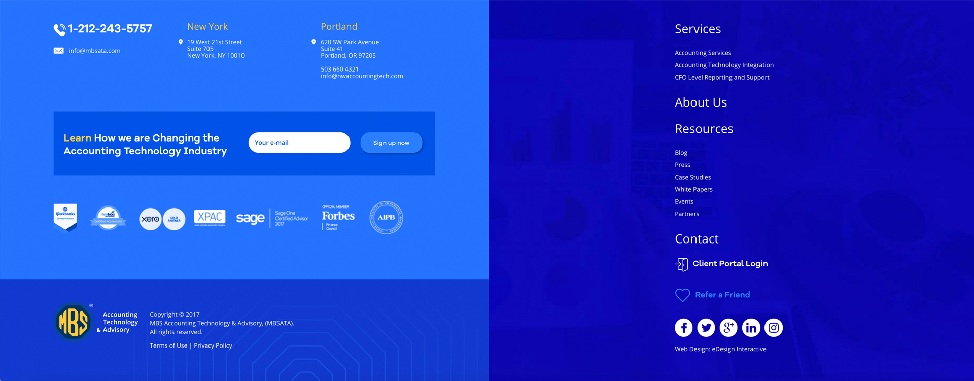
This footer contains lots of information, three calls to action (email sign up; client login, refer a friend), contact details, social media links, industry memberships, terms of use, and legal information. This is where colors, small graphics and design elements come in great help to put contrast around different pieces of information, create coercion, and give the data room to breathe.

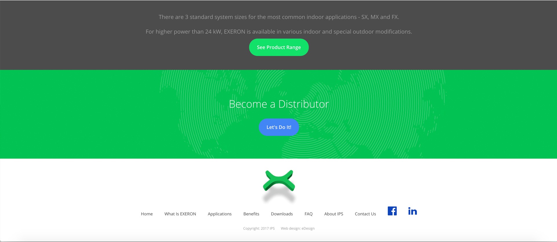
This is a great example of how to keep footer information very simple while accentuating the two main calls of action of this website: review the products and become a distributor. This could have been a very busy space but is now synthesize to the core of IPS’ business.
Footers are also a great way to place information that is important but does not need a full internal page, such as copyright statements, interesting links, partnerships, etc.:
-Your terms or services, privacy policy, and copyright notes
-Links to interesting information not included on your site (sister website, partners)
- Awards, certification, and industry memberships icons and links
-Link to your latest blog articles
And while this is a lot of potential information (your whole website summarized), let’s emphasize one more time how important it is to keep the footer content spaced and easy to read.
Link Optimization for Search Engines
While some websites use their footers as a keyword stuffer for SEO optimization, we highly recommend against it. A footer needs to be relevant, useful to humans, and organized intelligently. This is not a place to add links for the sake of SEO. However, a well-organized footer and pre-footer can help search bots to identify your information and classify your website.
Need to design a website that generates traffic and boosts your sales? Ask us for advice! Say hello@edesigninteractive.com.
