People are susceptible to words, patterns, and external influences. Understanding human behavior and predispositions can help you design a fantastic website that converts clicks into business.
LESS CHOICE, LESS CONFUSION
 Most companies feel like the more choices they offer online, the greater the customer base they can reach. In reality, offering too many choices can be tiring and confusing. According to Dan Ariely, faced with too many decisions- customers shut down, refuse to complete their purchase, procrastinate, or choose a less desirable option (check out his book “Predictably Irrational”).
To demonstrate the paradox of choice, Dr. Sheena Iyengar conducted a jam experiment at a grocery store in California. In a display of 6 different flavors, 31% of customers bought a jar. With 24 different choices, only 4% of people stop by to choose a jam. Customers presented with fewer choices were 10 times more likely to make a purchase compared with those who were shown more options.
Think about the choices you offer online. Could they be streamed down to the essentials?
FIND THE RIGHT WORDS
 In a famous experiment, Tversky and Kahneman demonstrated that people give opposite answers to the same call to action presented in different words. This is known as the framing effect. It explains why people are more likely to buy “85% lean”, instead of “15% fat” meat. Or opt for surgery when told they have an 80% chance of survival, instead of a 20% chance of death.
Images, signs, and words can either encourage or discourage certain patterns of behavior. A great website combines easy to use interface elements together with the right choice of wording. Words have the power to influence your clients’ perception of meaning. Choose wisely.
CREATE SMARTER DEFAULTS
 Our cognitive load is overwhelmed by the abundance of information. Not only that, but we have a strong chance of regretting our choices. Before the world was digital, you would never know if the product you bought changed its price overnight.
This combination of information overload and a high potential for regret discourages online users to make a decision and often drives them to pick a default choice (check out <span“The Paradox of Choice” by Barry Schwartz).
According to an organ donor study by Dan Ariely, users seem to pick a default choice even when faced with big decisions. The study shows that US states with “organ donor” as an opt-out option on their drivers’ license application have way more organ donors versus states with an opt-in choice people must decide on.
This is good news. When building your website, think of introducing smarter default options. By controlling the design of your application forms, you can predict how people will react. Another solution to break decision resistance is to bundle your products/services together or automate product combinations. A good example is the fast-food combo meal. It allows customers to say “I’ll take #2” and reduces the choices of 3 different items a customer has to make. This may seem like a small change, but it’s incredibly efficient at getting people to order more food, real quick.
DESIGN FOR EASY ACCESS
 Studying the human brain, scientists have found that we tend to follow the nearest pattern we can copy. Most of us favor shortcuts, or as psycholinguist François Richaudeau calls it “the law of less effort”.
For example, if two doors are open, but everyone seems to exists one of them- you will most likely follow the flow and do the same. Why? According to Kenneth Goodman, our brain performs cycles of sampling, predicting, testing, and confirming to find “the most reliable prediction with the minimum use of the information available.”
This process shapes our interactions with the world around us, but also our behavior online. In other words, by making a decision obvious, your online interface can activate desired actions and win more business.
This is where great website UX kicks in order to design a decision environment with relatively tight control. You can prompt customers to “choose” by guiding them straight to the desired option.
THE IMPORTANCE OF RELATIVITY
 According to another study by Dan Ariely, if people don’t know how much something is priced, they will try to assess its value by comparing it to other things in the immediate environment around it. (Check out his book “Predictably Irrational”. It’s a fun read).
Using this to our advantage, we can make a product or a service feel more valuable not by changing its price, but by changing the prices of the products/services around it.
CLEAN UP YOUR WEBSITE
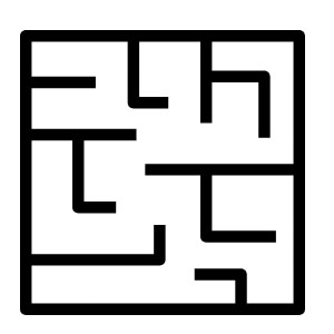
 There are no other ways to say this. Keep your site simple and easy to navigate. If people struggle to figure out where to click or need to complete too many steps before check out, they will quickly drop their purchase and leave your site. Believe me, people would rather go hungry than try to navigate through the maze of those government “food stamps” websites.
Use as much data as possible to improve your website. What do people search for using your search box? Where do they click? Does your homepage have any waste of real estate space?
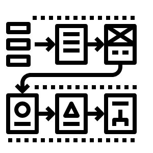
You need to understand your customers’ online journey. Print out every page of the sign-up process. Storyboard the steps to your shopping cart checkout. Where are the critical decision points? Can you eliminate some steps and ease the process?
Treat every decision and every choice your customers have to make as if it is nearly insurmountable. Assume that people are so overwhelmed by other priorities that even the smallest thing might dissuade them from closing the purchase.
For website advice, drop us an email at hello@edesigninteractive.com. We love making new friends.